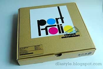
This resembles the pizza hut box isn't it? Yea~. Took an empty box from em' and modified its measurements to fit all my stuffs in. The making of the box from scratch, took me 12 hours, with 3 hours respectively before I decided on the final box to be used. Printed stickers and paste em on the box itself to have the 'parcel' feel.
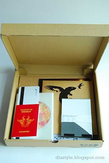
Contents: Passport size book, boarding pass, 1 DVD content, 3 x original adverts for New moon, A1 illustration (packaged), 30 x postcards (A6), 3 x 6R photographs for photography, Flux magazine (30 x 27cm) and a portfolio (17 x 20cm).
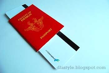
The passport (modified cover page) + boarding pass and a DVD contents of all my working files for this semester.
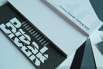
GRAPHIC
30 x postcards size:A6
theme: WHITE SPACE
Walking down familiar streets feeling loneliness and wary. Each individual showing its own reflections on their own white space.
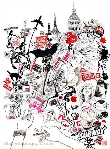
ILLUSTRATIONS
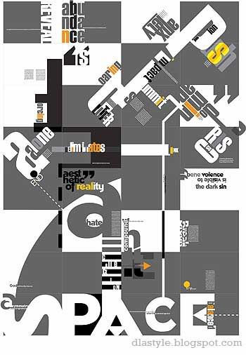
A1 size illustrations (theme: THINGS I LOVE)
Its all about the relationship between the canvas and the user. It illustrates according to the individual. In this case, ME!
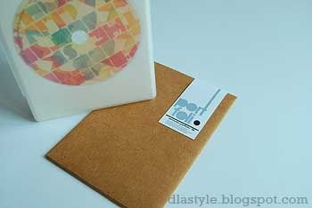
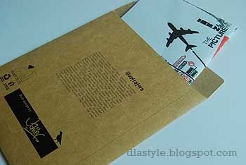
Original size; A1 is too huge and bulky to bring it to school again, so I went Nafa, all thanks to Alex lum, he helped me get the permission of his school library's A3 scanner to scan my A1 art-piece. Which then, printed out in A2, folded nicely and packaged it into a nice envelope, inspired by "don't panic" envelope where you can find along the streets of orchard rd and some retails. So it acts like a poster in it instead.
The front image looks familiar? yea~ it's the previous main picture for my blog! The whole image means:
Undergoing halluciation WITHIN your imagination
Don't underestimate the weak, always expect the unexpected
ADVERTS
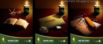
new moon essence of chicken
The design idea came from using Brands Chicken Essence as a brain fuel. It could be used by people of all ages and professions as depicted by the carious table items.
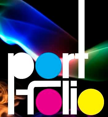
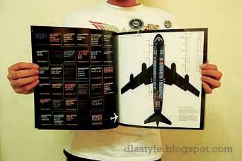
INTEGRATED
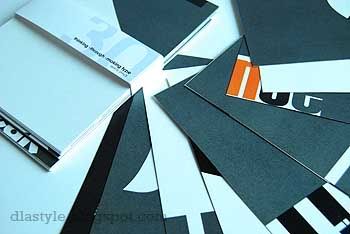
magazine design (brand: FLUX)
my theme: We Love typo+graphics / miscellaneous issue.
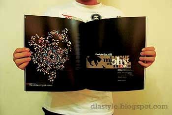
Mainly based on typography and illustrations and the revolution of both. Its a 42 page magazine designed by myself with lots of references around the globe.
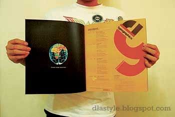
The logo is based on the magazine title; FLUX, The curves represent the flow of creative ideas. The color range used are namely Cyan, Magenta, Yellow and Black, collectively known as CMYK, which is what comprises printing colours used.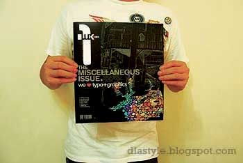
Thanks Kaedon for the awesome post for my camera. My favourite item in my portfolio would be the envelope with my printed A2 illustration in it. Well at least to me its unique in its way. And that marked the end of semester 1.
loves? hate?
Any comments? good / bad / Whatever.
TAG now!>>
● Current mood: home
